Pantone Colour of the Year announced: Unveiling the trending brand colours for 2024-2025
- Lyn Spindley

- Dec 18, 2023
- 5 min read
Updated: Sep 21, 2025

Keeping your brand fresh and engaging can be a continuous challenge. One of the effective ways to keep up with the latest trends is by incorporating new colours into your branding strategy.
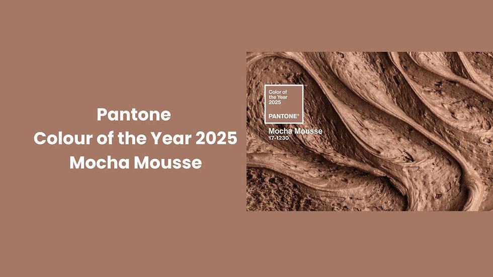
Announced! Pantone 2025 Color of the Year, Mocha Mousse Hex Code A57865! Read all about it here.
The Pantone Colour of the Year has always been the most anticipated announcement for brand owners and marketers as it signifies the upcoming trends and evolutions in the industry.
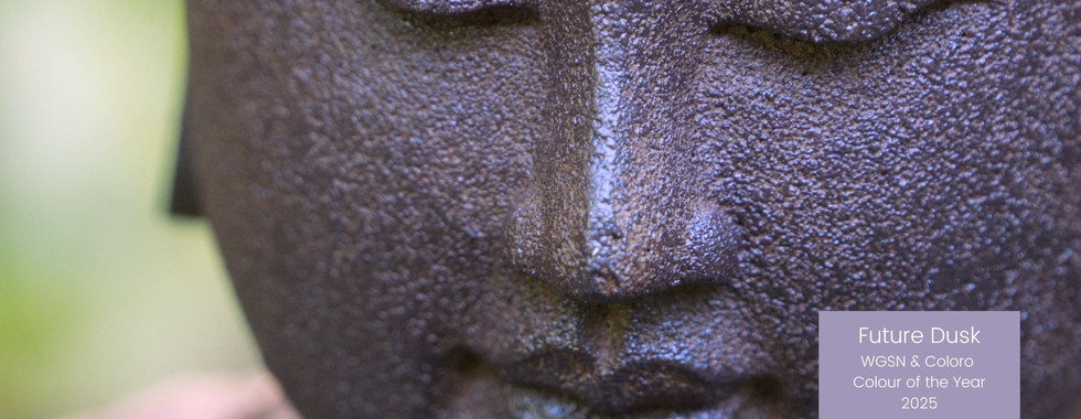
The newly unveiled 2024 Pantone Colour of the Year is Peach Fuzz, and the WGSN Colour of the Year 2025 is Future Dusk.
These colours reflect the current societal trends, emotions, and needs, making them a perfect tool for businesses that want to refresh their brand identity, both digitally and socially.

In this article, we'll share some tips and tricks on how to use Peach Fuzz and Future Dusk to revamp your brand identity. We'll also highlight some of the ways these colours can inspire you to create visually stunning social media images.
Why is brand colour important?
Colour plays a crucial role in brand identity, and it can elicit emotions and set moods for your customers. That’s why incorporating the Pantone Colour of the Year can be a great way to refresh your brand. For instance, using Peach Fuzz in your brand logo or on your website can make your brand appear cheerful and optimistic. On the other hand, Future Dusk is a calming yet deep colour that can evoke feelings of hope, tranquillity or even act as a reliable canvas to layer more energetic colours upon for maximum impact.
Why it’s important to keep your brand fresh with colours
Staying on trend
Colour provides an opportunity to stay on-trend and demonstrate your brand’s versatility. Consumers always look for fresh, new trends, and incorporating trendy colours can attract more prospects to your brand, especially the younger generation. Peach Fuzz, for instance, inspires brightness and optimism, conveying the message that your brand is forward-thinking and innovative.
Creating an emotional connection
Colour can evoke emotions from your customers, and have a strong psychological impact. Colours have always been used to express emotions and can subconsciously influence how people feel about your brand. Using Peach Fuzz for branding purposes can convey feelings of warmth, joy, and comfort. Future Dusk, on the other hand, signifies sentimentality and nostalgia, which can attract a more mature audience and evoke trust and reliability in your brand.


Increase brand recall
Increase brand retention and build brand loyalty by consistently using the Pantone Colour of the Year and WGSN Colour of the year across your branding initiatives. Customers will develop an association with your brand and be loyal to it. Using Peach Fuzz and Future Dusk can create a brand experience that is memorable and sets your brand apart from your competitors who may be simply using tan, orange, navy or purple in their brand.
Flexibility and creativity
You can use the Pantone Colour of the Year to accentuate and revamp your existing branding initiatives such as your website, social media accounts, marketing materials and packaging. You can also use Peach Fuzz and Future Dusk as an accent colour to complement your existing brand colours. These colours can provide you with limitless creative opportunities and possibilities.
Complement your existing brand
The beauty of Peach Fuzz and Future Dusk is that they're hugely versatile and can complement any existing brand. If you have a brand that is already minimalist and slightly monochromatic, Future Dusk would be an excellent complement. On the other hand, if your brand uses an abundance of colour and needs a fresh pop, Peach Fuzz would be a perfect choice. Either way, these colours are excellent for creating a modern, chic, and stylish look.
All about Peach Fuzz
Peach Fuzz is a beautiful, warm shade that is sure to stand out in any branding collateral. Its soft and inviting tone is perfect for companies that want to exude a sense of approachability and friendliness. Consider incorporating Peach Fuzz into your website, social media graphics, or logo to add a splash of colour that catches the eye without overwhelming your audience.

… and Future Dusk
Future Dusk is a subdued, timeless shade that conveys a sense of stability and sophistication. It's perfect for companies that want to exude a professional image and don't want to come across as too playful or lighthearted. incorporating Future Dusk into your branding is an excellent way to signal to your customers that you take your business seriously and strive to maintain your reputation. For example, Future Dusk can be a perfect choice for the service-based business or a B2B organisation that wants to show a strong professional image.

Both great choices
While Peach Fuzz and Future Dusk are both great choices for refreshing your brand, make sure you consider which one is right for your company's specific needs. For instance, if you want to create an energetic, fun-loving vibe, Peach Fuzz is an excellent option. However, if you're more focused on creating a timeless, elegant brand image, Future Dusk is the better choice. Think carefully about which colour best aligns with your brand's message to achieve the desired outcome.
Using these new colours in marketing
Peach Fuzz is a warm hue that works great with contrasting colours. If you want your brand to stand out, you should pair it with cool colours like navy blue, grey, or forest green. Alternatively, Future Dusk is a cooler hue, which pairs perfectly with warm colours like terra cotta or mustard yellow. A contrasting combination of Peach Fuzz and Future Dusk could also be visually stunning.
What about Apricot Crush?
Our eagle-eyed readers will know the WGSN / Coloro Colour of the Year for 2024 was Apricot Crush – practically identical to the Pantone Colour for this year. This fact underlines how important this peachy - apricot tone is this year. It's important to note that Pantone and WGSN both base their colour predictions on insights into global and cultural trends, and both companies use different processes to arrive at their decision. That being said, both companies have predicted that peachy tones will be making a strong comeback in 2024. Peach Fuzz and Apricot Crush demonstrate that there is a top trend that can help guide brands on how to use colours in their branding and marketing.

Colour is essential for your brand
Colour plays a huge role in our daily lives, and Peach Fuzz and Future Dusk are no exception. By incorporating the Pantone Colour of the Year into your brand identity and social media, you can refresh your brand and create a visually stunning, cohesive, and modern presence.
Whether you're a small business owner or a large corporation, keeping up with the latest design trends can set you apart from your competitors and evolve your brand identity. Use these colours to inspire your creativity, and don't be afraid to experiment with contrasting colours or unique design elements. Dazzle your audience with Peach Fuzz and Future Dusk, and watch your brand shine.
Interested to learn more?
We're colour experts here at Treat, and have a wealth of tools and inspiration to help your brand get a new lease of life. Book in a free consultation today - simply email hello@treatmarketing.co.uk


Comments